
For the past few years I’ve seen a lot of glittery inks hit the market, but I’ve mostly avoided them. In part it was because the ones I had run across were expensive ( J. Herbin bottles were close to $30), and in part it was because there was something about them that reminded me of glitter-encrusted cheer posters from high-school.
And then I was looking at the inventory at PenChalet and I saw that a couple of little 15ml Colorverse bottles were for sale for under $3 each, and I couldn’t resist: I ordered Warped Passages and Anti-Matter1I can only assume that these little guys were somehow separated from their sets and were being sold at the discount as “open items”, essentially..
The Color
Colorverse Warped Passages has a sober, slate-blue base that leans slightly towards teal. On the first pass, the color is a medium tone, but it darkens very quickly for a nice amount of shading where the ink is thicker. Two passes produces a dark, military blue, and three passes becomes nearly black.

On cheap copy paper, however, the ink is very wet and soaks through almost immediately. As a result, there’s much less tonal variation and shading, the shimmer is not at all prominent, and the hue seems slightly more green to me (though it’s a very subtle difference, I admit).


When it comes to the hue of the ink, I don’t have anything else that is very similar. I rubbed a few swatches onto a piece of paper just to see, but none were even close.

In the image above, the inks are as follows (from left to right across the top row): Iroshizuku kon-peki, Colorverse Warped-Passage, Waterman Blue-Black, Baoke Pure Blue (MS211), and the bottom swatch is Pelican’s Edelstein Topaz.
Shimmer Quality

The shimmer is, as you might expect, only visible when it catches the light; otherwise it may be completely invisible. The shimmer is silver.


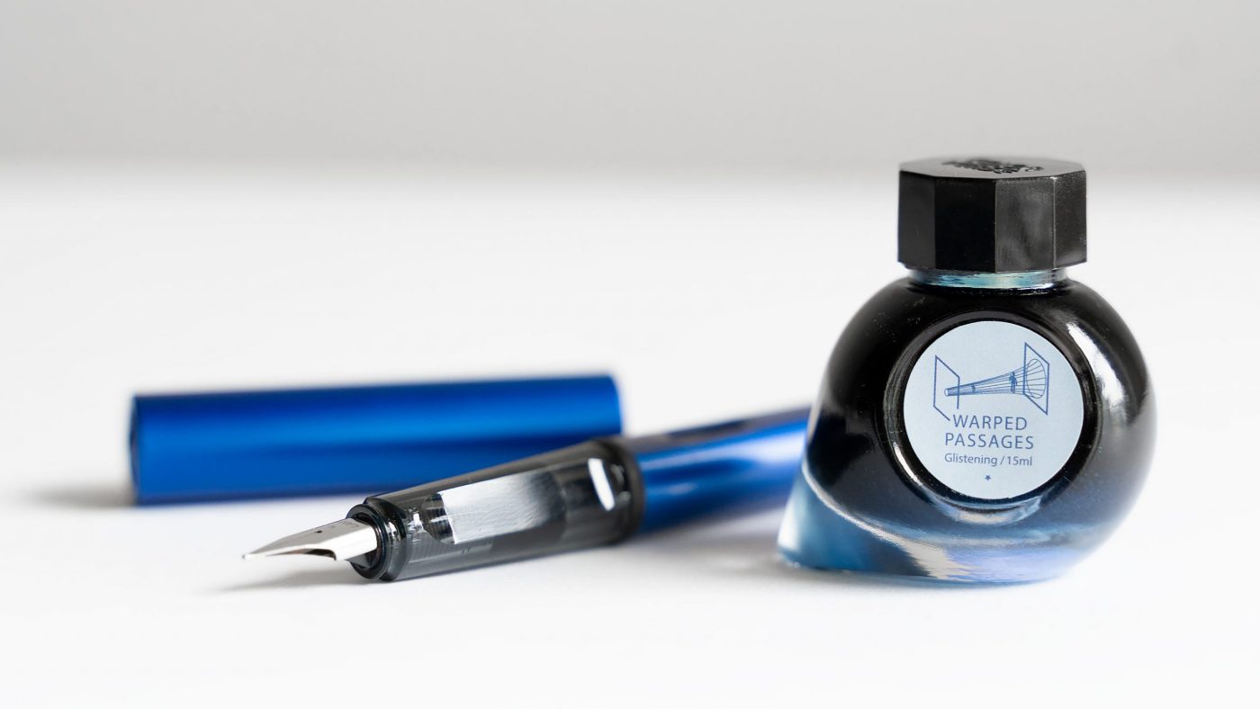
The Bottle & Packaging

Putting aside the fact that the bottle is tiny, it is made of wonderfully heavy glass with an interesting (if not practical) shape, which is a big plus in my book. I have plenty of bottles of ink on my shelf that were purchased in large part because I liked the look and feel of the bottle’s glass (Pilot iroshizuku, Edelstein, etc).
Unfortunately, the blue on blue label sticker looks boring and cheap, to me, and detracts from the whole thing. I’d have preferred no label at all.
I haven’t done any systematic testing of this ink yet. I’m not sure how long it takes to dry or how wet it is compared to other inks. When I got it, I was only concerned about the color, and I love the color. I’ll update the review as I’ve had more of a chance to test it.
Any questions or experiences with this ink? Let me know in the comment section below!