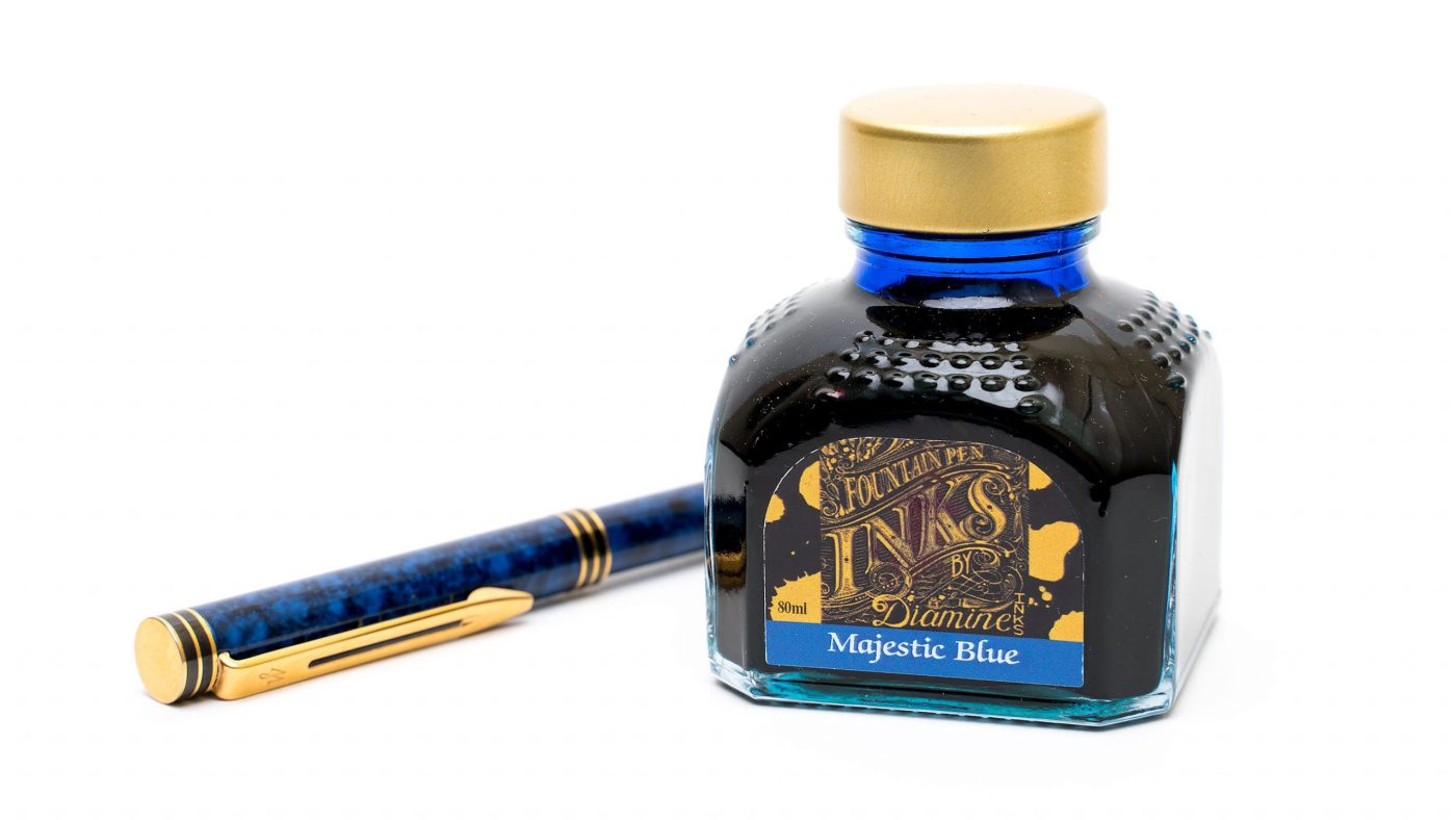
When I first started getting interested in sheening inks, this was the first bottle that I bought, not because it was clearly the best, but because it was recommended by Brian Goulet in a YouTube video about sheening inks, it was easy to find and not too expensive. As it turns out, the ink is pretty decent: the sheen is heavy enough that it usually shows up with a wet pen and normal handwriting, and the underlying blue shades nicely.
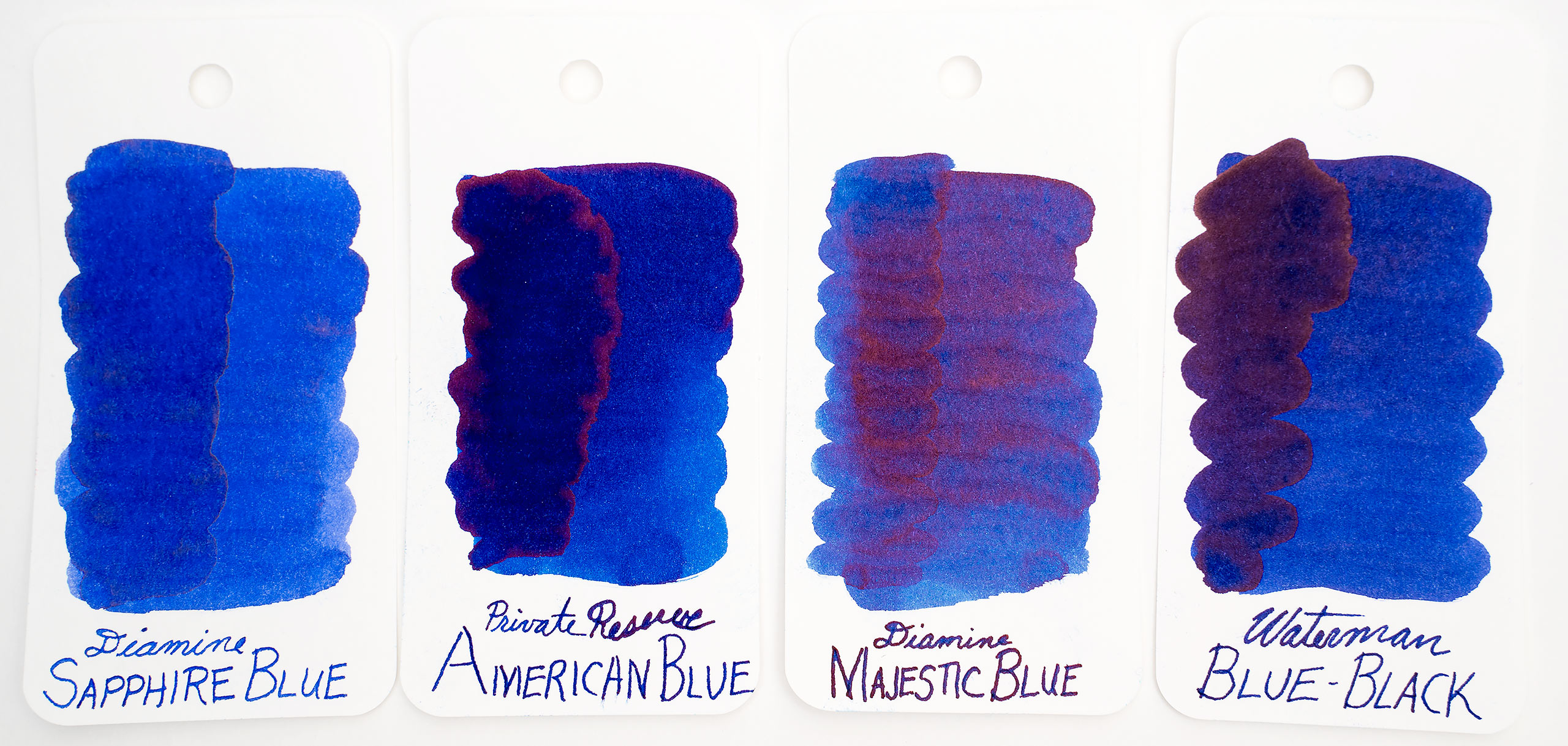
My only other Diamine blue ink at the time was Sapphire Blue, which I was pretty happy with, but I was surprised to find that the underlying color of Majestic Blue was much less saturated (which undoubtedly helps it shade).

The sheen is more red than purple, and is not especially metallic, so it doesn’t produce the jewel-like glistening in my writing like Krishna Moonview 2 does. Still, the sheen does reliably show up, and it adds a nice highlight.

It appears that there is some variation in the production of this ink, because other reviews I’ve seen show the ink as purple-leaning and with heavier sheen. Mine leans slightly toward turquoise, if anything, and the sheen is reddish rather than pink/purple. Odd.
I’ve also heard complaints that the ink dries quickly on the pen nib, and mine also does not. In fact, drying time in general is pretty slow, depending on the stroke thickness. Strokes that went down wet took about a minute and a half to dry completely.

The ink has no water resistance to speak of. The flow is medium wet, but I don’t have any issues with feathering or bleed through (but I never do on Clairfontaine, I’m going to start testing on a wider variety of papers).
As I mentioned above, the base hue of Majestic Blue is similar to Diamine Sapphire Blue, but it is not as saturated. The sheen is more prominent throughout the ink, where inks like American Blue and Waterman’s Blue-Black only sheen at the edges of where the ink has pooled.
However, the sheen is pretty modest compared to something like Krishna’s Moonview 2 or Organic Studios Ralph Waldo Emerson.

All in all, it’s a great ink for when you want some sheen but don’t want to go over the top. I keep this in my blue LAMY Al-Star, usually.
What do you think? Are your experiences with this ink like mine, or do you find the ink to be more purple and quick to dry? Let me know in the comment section below.