I love the idea of multi-shading inks, though most of the ones that I run across are too pale to be useful for day to day use. That hasn’t stopped me from buying a few of them, though. I ran across a couple of Pennonia inks last week, and I couldn’t help myself: I bought Balaton-kek and Danuvius.

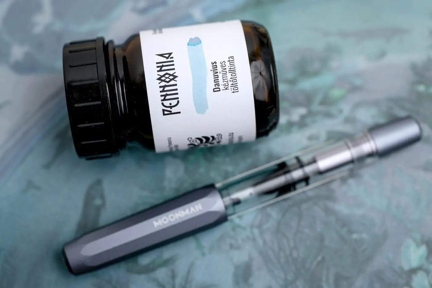
“Danuvius” is the Latin name for the Danube River which flows through a good swath of Europe, including Hungary, where Pennonia inks are made. Pennonia inks generally are sold in cylindrical, wide-mouth 50ml bottles that are made of brown glass (which protects the ink against damage from sunlight). The labels each have a small swab of ink on them, which is a nice touch.

I swabbed Danuvius on several papers, cheap and expensive, and the ink behaves differently on each, but on non-absorbent papers like Tomoe River and Cosmo Air Light, there’s a fair amount of color separation with pinkish thin areas.

When using a glass dip pen, I couldn’t get Danuvius to flow at all. It was among the most truculent, dry inks that I’ve encountered. However, when I inked up a pen, flow was just on the dry side of medium. Not too bad. Even when I used a large Speedball B-3 nib, the ink didn’t feather. It does take a little longer than usual to dry, but not outrageously long.

No matter what nib size I use, there’s a good amount of shading when I write. Light areas can be so thin that they nearly disappear, and dark areas can border on being as dark as a typical writing ink. When I use a large calligraphy nib, the dark areas are easily as dark as standard inks, which makes a nice contrast, and only in this case does any of the pink that we see in large swatches begin to appear in the actual lettering.


Overall I find this to be a beautiful ink, but not a very practical one. And that’s fine… not everything in life has to be practical. In poor light, anything written with Danuvius with a fountain pen (F to B nib) can be tricky to read, though good light makes a huge difference.
What do you think? Do you enjoy these pale, multi-colored inks?