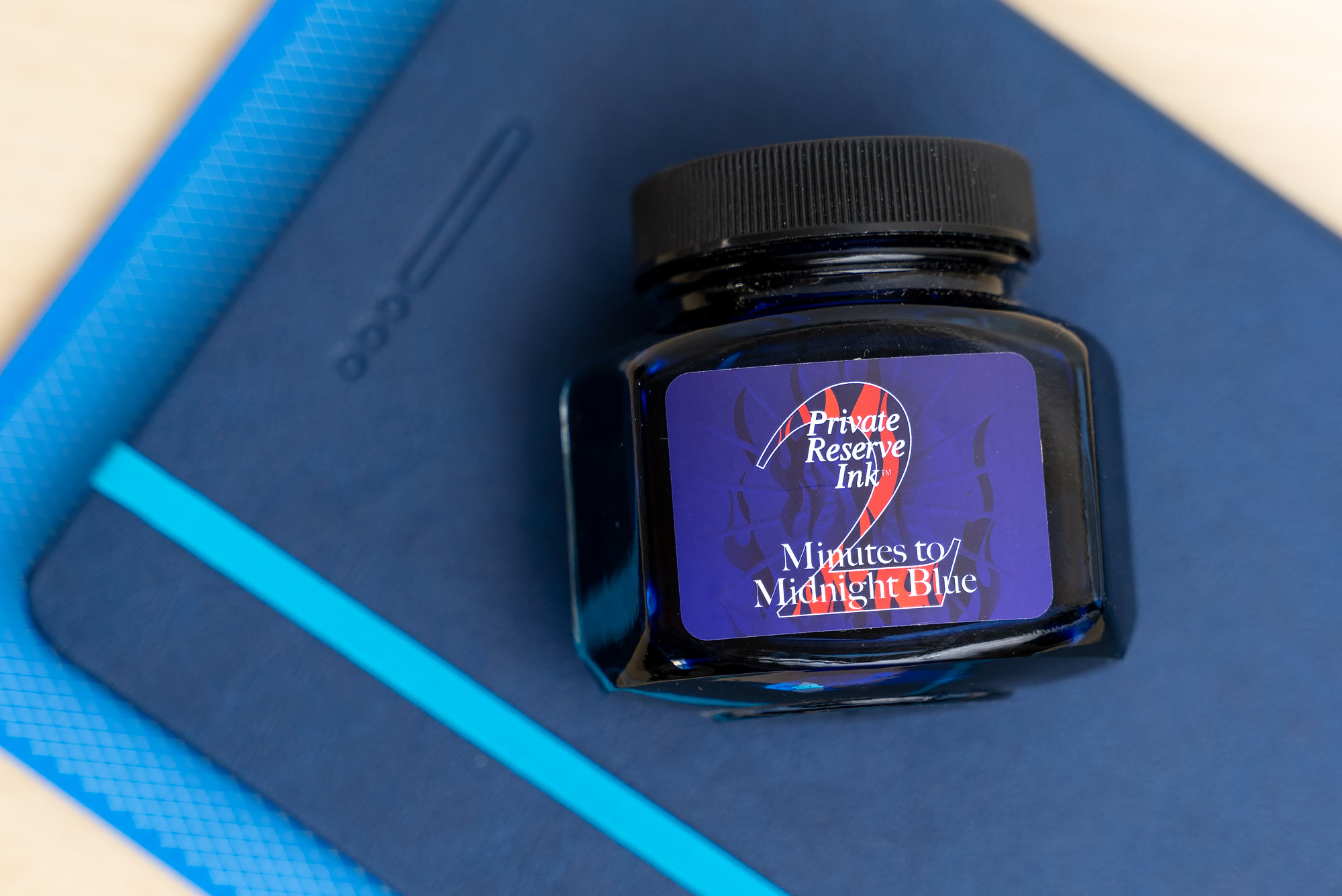
Private Reserve’s “2 Minutes to Midnight Blue” is their first limited edition ink; this one is limited to 1100 bottles, so it probably won’t be hard to get if you want it, but it won’t last forever. I ordered this bottle from Pen Chalet, and I don’t know if it’s available anywhere else. It arrives in a well decorated box, and continues the clock theme with a clock face on the lid.

The ink bottle itself is quite a bit larger than a standard 60ml Private Reserve bottle; it’s 110ml and a wide hexagon rather than being cylindrical.
There’s some room for interpretation with the ink’s name. On the back of the box (along with a hand-written bottle number), there’s a brief explanation of the name that makes a reference to writing about the events of an interesting day in the middle of the night.


That’s all well and good, but the name is also a pretty transparent reference to the Doomsday Clock that is managed by The Bulletin of the Atomic Scientists. In 2018, the bulletin moved the clock ahead, saying “It is 2 minutes to midnight”, based on the situation with North Korea and their nuclear arsenal at that time. This makes me wonder whether Private Reserve developed this ink at that time but didn’t release it because the company was in a state of flux (they changed hands recently). As of 2020, the clock is at 100 seconds until midnight, due to COVID-19, which is what makes this somewhat curious.
Or, maybe the creator of this ink was an Iron Maiden fan, and it is named after their 1984 song.
In any case, 2 Minutes to Midnight Blue is a medium-dark true blue ink. I haven’t had a chance to do much writing with it yet, but so far it seems like a medium-wet ink.
The color is well saturated, and consequently, shading is moderate, but I was a little surprised to find that the sheening was also very minor. When it does sheen (only when the ink pools in large swabs on Tomoe River paper), the hue is a subdued bronze tone.


There’s nothing particularly spectacular or unique about this blue; it’s similar to quite a few others in my collection, but that’s because it’s a good, popular color. Below, I’ve compared it to a few other dark blues that were nearby in my swatch book, including a couple that were midnight-themed.

Here, you can see a couple of basic writing samples, one on a ruled Rhodia notebook, and another in an unruled notebook with Tomoe River paper (68gsm). The ink ends up giving me a little more shading than I expected!


What do you think? Do you like this color blue?
I like the saturation and the vivid color in large swatches, but I do prefer a slightly brighter blue when I’m actually writing. Let me know what you think in the comment section below!