While I was pestering the good folks at Krishna Inks a few weeks ago about one of my orders (it seems that I’ve been buying a lot of Krishna inks lately), they were kind enough to offer me a pre-release bottle of a new ink to review, and I agreed (obviously), but they said nothing more about it and didn’t give me any hints about the ink until it showed up at my door two days ago.

This is Krishna’s first ink in its “Urban Series”, and it is called “Peacock Blue”. Perhaps the most unique thing about this ink is the fact that its color is 98% dye based but 2% pigment based. This is the first ink that I’ve ever encountered that contains both dyes and pigments… most fountain pen inks stick with one or the other. In any case, because the pigments make up such a small portion of the ink, it should be completely safe for fountain pens, but the presence of the pigments is supposed to make the ink very vibrant while allowing for the ink to shade.
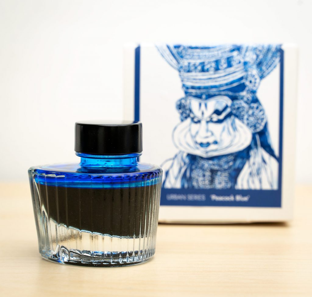
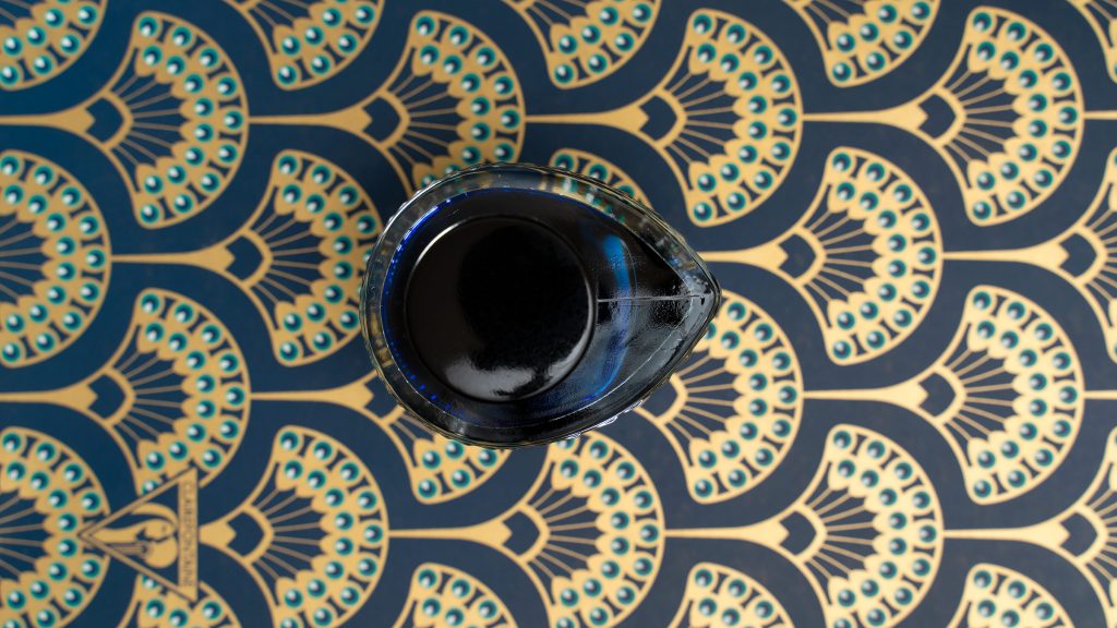
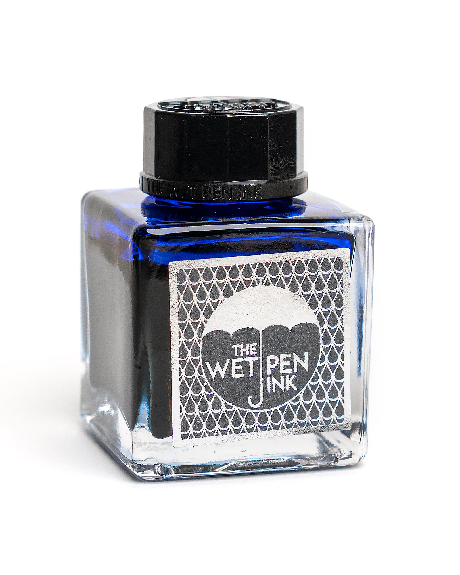
Krishna has produced some interesting ink bottles in the past (Paakezah is one of my favorites), but nothing like the Peacock Blue bottle. From the top, the outline of the bottle is the tear-drop shape familiar to everyone who has seen a peacock feather, with the bottle’s cap in the place of the dark eye-spot of the feather’s design. The fluted sides of the bottle taper down to the base, and the bottom of the bottle is even more beautiful than the top, with a central bulge that acts as a lens to show off the color. It’s a 30ml bottle, and will cost about $16 USD.

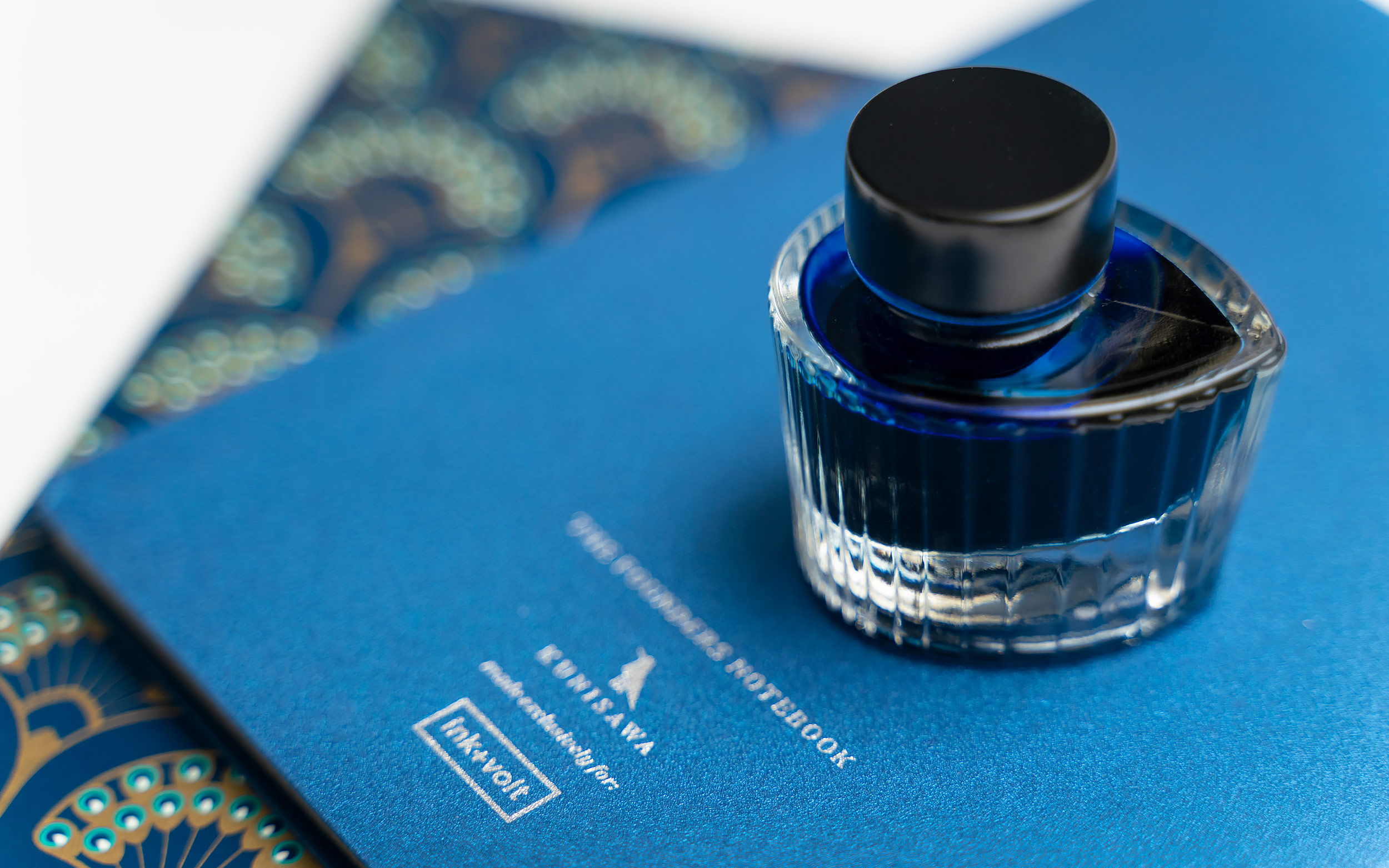
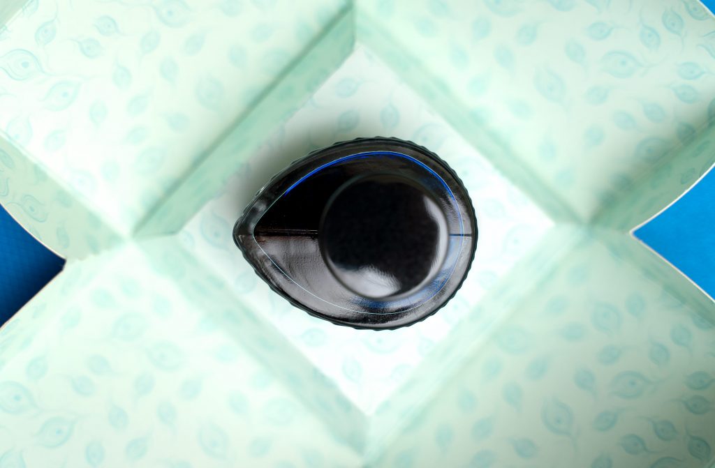
On the interior of the bottle, the bottom slopes towards the cap end, which should make collecting the final drops of the ink a bit easier.
But as beautiful as the bottle and packaging are, the ink itself is really what I we care about in the end. What’s it like?
The ink is a vibrant blue that leans very slightly towards green, though it is essentially what I would consider a “true blue” ink. It is so vibrant that the sRGB gamut doesn’t really have a place for it, but I’ve done what I can with these photos. One Tomoe River, when I put down enough ink, I get a touch of magenta sheen, but as a rule the ink does not sheen at all.

I’m an avid fan of vibrant blue inks. Most of my very vibrant ones tend to sheen quite a bit, though, so a non-sheening vibrant blue is a nice change. Birmingham’s “Angelfish” is the only ink in this color range that has comparable vibrance, but it also sheens quite a bit. Horizon Blue and Diamine Blue Velvet are both nice and saturated as well, but less green.

I was able to get Peacock Blue to sheen a little, with heavy application on 52gsm Tomoe River paper.

Ink Behavior
I’ve already mentioned that this ink does not sheen, but it does produce some shading… more than I’d have expected from an ink that is this saturated. Flow is rather “dry”, it does not flow well from a glass dip pen and my attempts to use it in a flex-nib pen have been met with lots of railroading and interruptions.
In standard fountain pens, though, the ink is wonderfully behaved. I get no feathering or bleed through, and there’s a beautiful amount of shading as long as the pen isn’t too wet. No hard starts, and the ink is nice and smooth. Dry time is on the quick side of average.


Even though this ink does contain some pigment, it’s not waterproof overall; its dye base washes away pretty easily, but does leave behind a readable ghost.
What do you think? Do you like these blue inks as much as I do? Let me know in the comment section below!