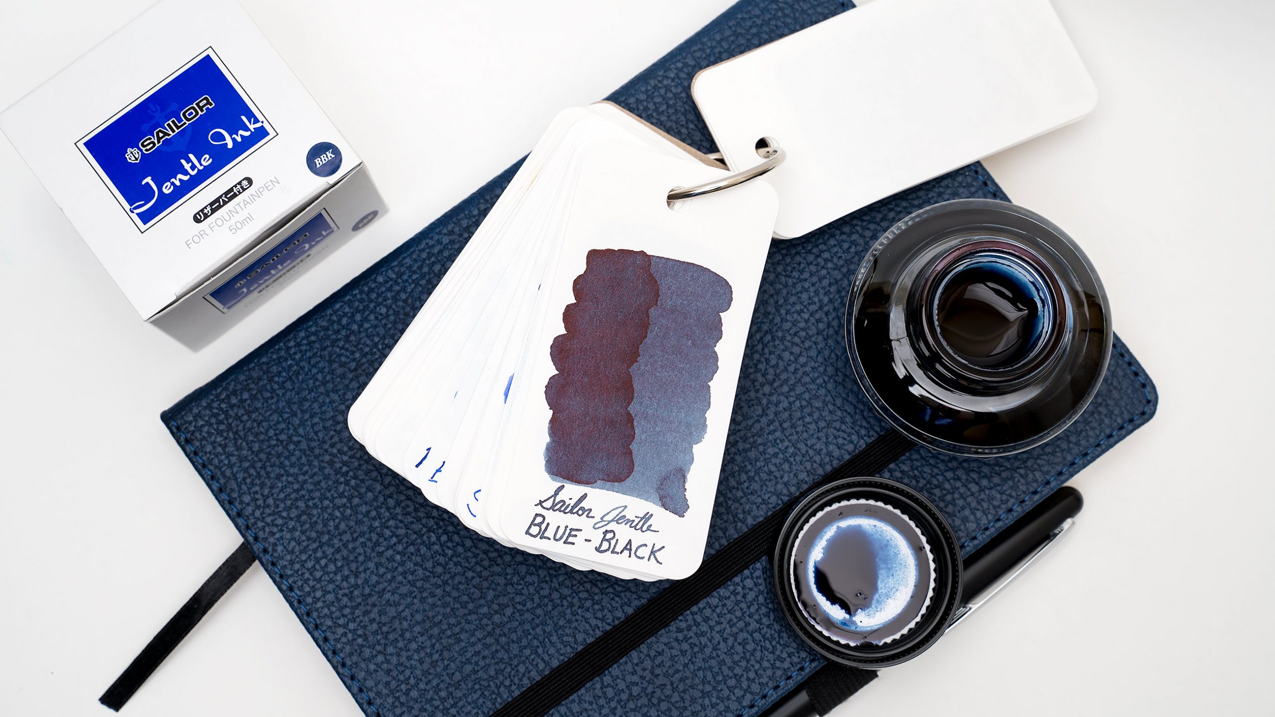
In my ink-collecting zeal one afternoon, I bought this bottle of Sailor Jentle Blue-Black ink at the Kinokuniya book/stationery shop in Seattle’s International District for $20, which is almost (but not quite) double what I would have paid for it if I’d just stayed home and let Amazon deliver it to my door. It wasn’t even the ink that I’d gone there for; Sailor Yama Dori was my quarry for the day, but it was out of stock, and as I looked through a notebook of color swatches, this grabbed my eye.

Blue-blacks have never been my thing because most of them are just dull, desaturated dark blues. At least, the ones that I bought in cartridges as a teenager were.
But this one was different. In the sample swab that I saw, the ink appeared to be a dark, subtle blue-grey leaning towards teal. It was the subtle green influence in the color that made me jump on it.

And this is how the ink turned out. It’s a beautifully unsaturated blue-green that darkens up to a near black when put down heavily.

I immediately loaded the ink into a pen with a flex nib and started playing around with it, and I was very pleased with the variation in tones that I got, though they dried to more similar tones than I expected.

It’s a well-behaved ink: it dries quickly, and has good, medium flow. I wouldn’t call it water resistant, but it does appear that it can withstand a couple of drops of water without being completely obliterated.
I’m always satisfied when I start looking through my inks for similar tones for comparison and find that I don’t have anything that’s similar. That’s the sign of a good ink purchase, as far as I’m concerned. My Colorverse inks also appear pretty desaturated until you put them next to this Jentle (and the pink of the Anti-Matter suddenly becomes very visible).

In the end, I’d say that this ink is exactly what I expected and I’m very happy with it. It’s great for those times when I want something subtle and blue-grey rather than Baystate Blue levels of electric blue.